Pepsi Unveils New Logo
It's been 14 years since Pepsi changed its logo, but today they unveiled a brand new one. Wait, Pepsi changed its logo 14 years ago?

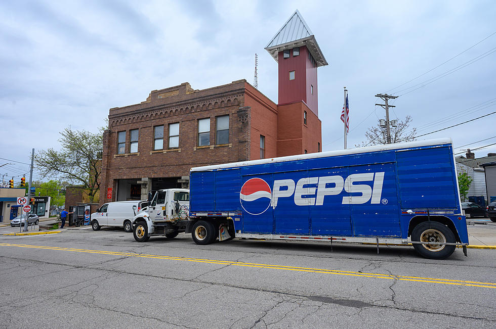
New Pepsi Logo
Logos for companies are a serious thing. It's crucially important to get it right, to keep it simple, and in doing both make sure it represents your product, or brand perfectly with no confusion.
Arguably, Pepsi is a shining example of this.
For as long as you can probably remember, the Pepsi logo has been a simple red, white, and blue circle with PEPSI written either inside of the circle, under it, or to the side of it.
In 2008 Pespi made a slight change to its iconic logo, changing up the flow of the red, white, and blue swirl inside of the circle and going for a more minimalistic approach with the brand name by having PEPSI changed to all lowercase pepsi.
Pepsi spent $1 million on that logo change in 2008.
From zenbuisiness.com -
"The design of the new emblem channels the ideas of the golden section, Earth’s magnetic field and gravitation, Fengshui, and other fields of knowledge. Encrypted meta messages were meant to add more appeal to the brand and forge an emotional bond with the customers."

Whether you've realized it or not, that's how the Pepsi logo has remained for the past 14 years.
Today, Pepsi unveiled the latest incarnation of its logo.
To celebrate Pepsi's 125th anniversary, they unveiled a brand-new logo.
From the Pepsi press release via usatoday.com -
"The new design evolves the Pepsi brand to represent its most unapologetic and enjoyable qualities, and will span across all physical and digital touchpoints, including packaging, fountain and cooler equipment, fleet, fashion, and dining."
KEEP READING: Check out these totally awesome '80s toys
Gallery Credit: Angela Underwood
More From Hot 107.9
