Pantone 448 C is Selected as the Ugliest Color in the World—Your Living Room is Not This Color is It?
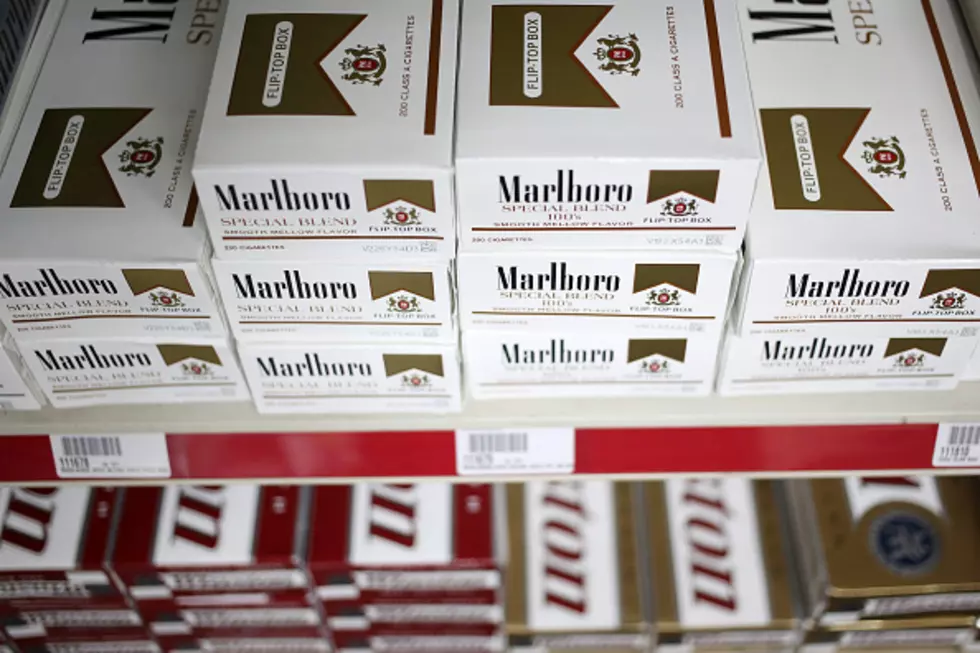
It's still official as of 2022, Pantone 448 C is the ugliest color in the world. Pantone 448 C was labeled the ugliest color in the world back in 2012 when Australia started putting it on plain tobacco and cigarette packaging. It was determined by market research to be the "least attractive" color in the world.
We sure hope your living room is not this color. However, to be totally honest, not everybody hates it. The Australian Department of Health originally called it, "olive green". But they changed the name after the olive industry expressed, shall we say, their unhappiness. They didn't want the ugliest color in the world associated with the olive industry in any way, and can you blame them?
Here in the United States, we would probably describe it as more of a "drab or dark brown". At least that's what Wikipedia says anyway. Wikipedia also claims that "France, the United Kingdom, Ireland, Isreal, Norway, New Zealand, Slovenia, Saudi Arabia, Uruguay, Thailand, Singapore, Turkey, Belgium and the Netherlands" also use Pantone 448 C on their tobacco and cigarette packaging as well. (Here in the good Ol' USA, we still use bright colors like white, red and green.)
Yeah, all by itself it does have an unlovely appearance. Kind of a gray bile gravy look. Charitably, I'd call it dark weathered bronze. But! Paired with just the right color of medium-dark, vibrant evening blue, this poor old forlorn orphan color could work. Not saying that I want to be the one to test it out, though. -Flautist
This is the color of my TV screen after the power is on but the Roku page has not yet loaded, awake but still thinking about if it wants to wake. -Pamela B.
So are you ready to see what the world marketing experts have labeled the "ugliest color in the world" after extensive research?
Scroll down...for the reveal.
LOOK: Famous Historic Homes in Every State
More From Hot 107.9


